02 · EdTech · 2025 · 3IT
One platform for the whole student journey.
Universidad de Las Américas ran on more than five disconnected systems. I designed Student 360°, a single platform where academic, financial, wellbeing and retention data finally live together for 10,000+ students.
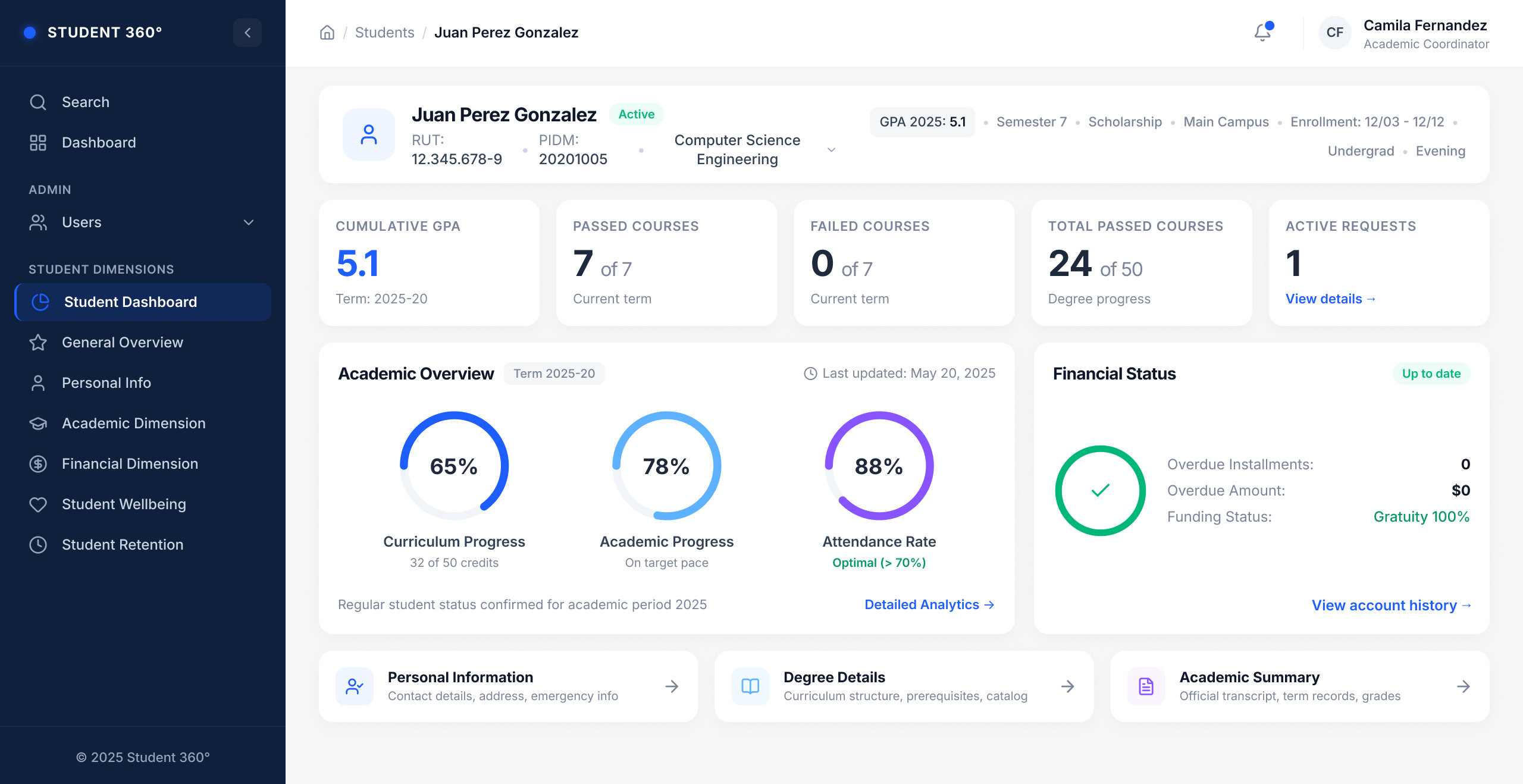
Student Dashboard: one screen answers "how is this student doing?" GPA, courses, progress, attendance and finances at a glance.
Five systems, zero shared picture.
Academic records lived in one system. Payments in another. Wellbeing flags, attendance and retention alerts each in their own tool. Staff jumped between platforms to answer a basic question: is this student okay? Students had no unified view of their own situation.
The brief: consolidate everything into one coherent platform without losing the depth of each source system.
From information architecture to a scalable system.
I owned the UX/UI end to end within the 3IT team: mapping the data landscape, defining the information architecture, and designing 30+ screens, from KPI dashboards to AI-assisted interfaces, on a component system built to scale.
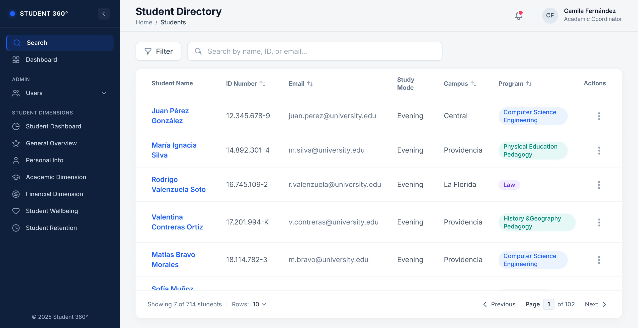
Student Directory: every journey starts by finding the right student, searchable by name, ID or email.
Structure first, then surface.
My industrial design training shows here: before drawing a screen, I mapped what each system held, who used it, and which questions people came to answer. That map became the architecture: one student profile, organised into dimensions.
- One student, one profile. Academic, financial, wellbeing and retention dimensions sit side by side in a persistent navigation, instead of behind five logins.
- Dashboards that answer questions. Each view is built around the decision it supports, so staff act without decoding raw tables.
- A system, not screens. The same header, cards and navigation patterns repeat across every dimension, so the platform grew past 30 screens without redesign.
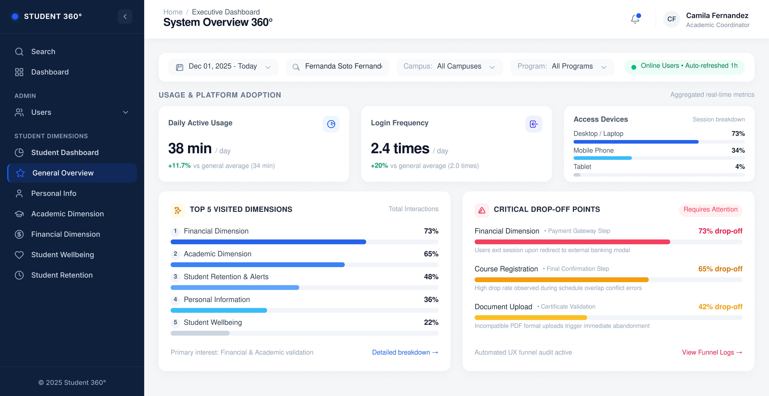
System Overview 360°: adoption metrics next to the navigation drop-off points, so the team sees where the experience needs work.
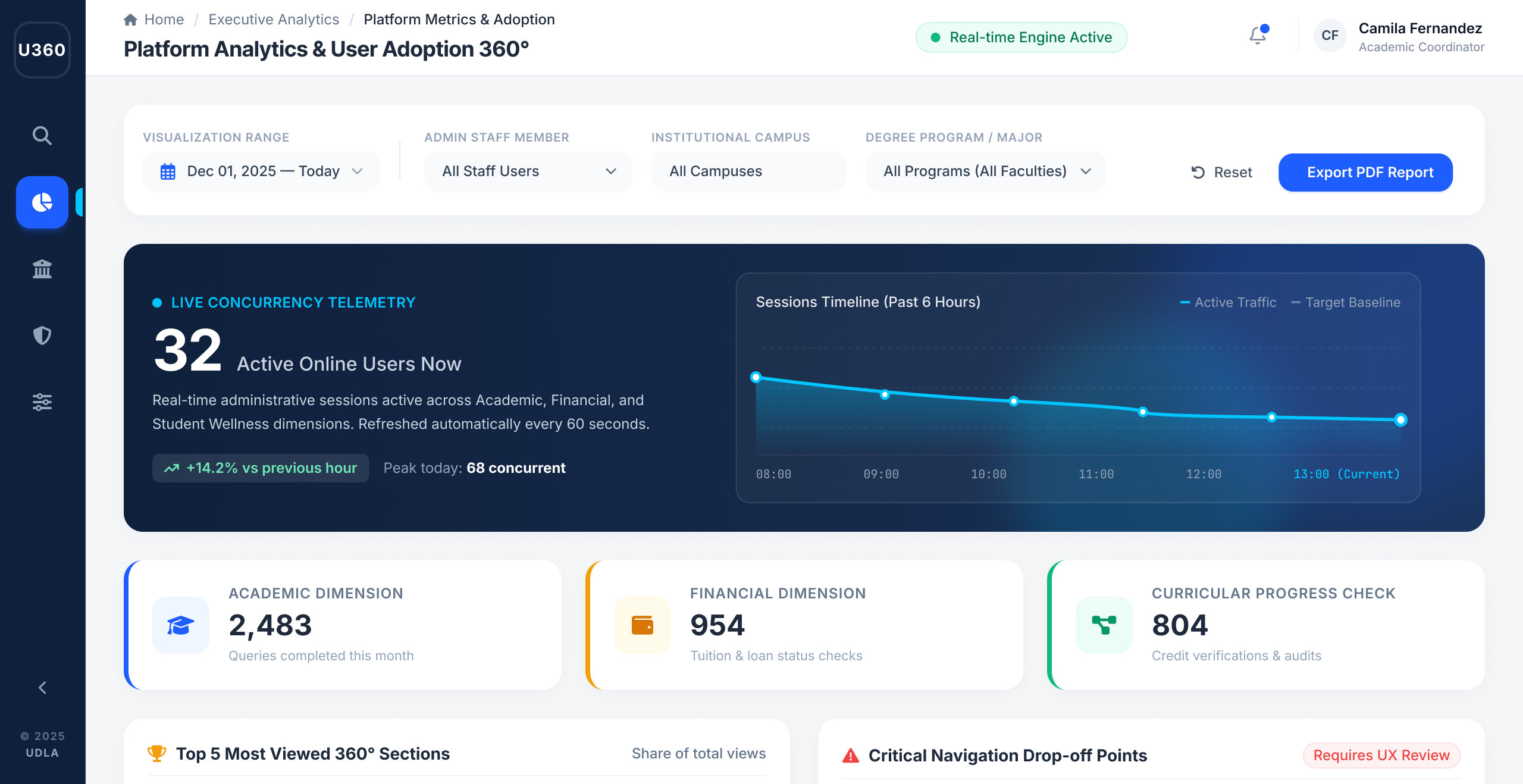
Platform Analytics: live usage across the academic, financial and curricular dimensions, refreshed every minute.
Complexity, consolidated.
A single source of truth for the entire student lifecycle, designed, documented and handed off as a scalable system.