01 · SaaS · 2026 · Freelance
Redesigning a SaaS site, 20+ pages at a time.
Rindegastos is a leading corporate expense management SaaS in Chile and Latin America. I redesigned its entire public site for desktop and mobile: homepage, product pages, pricing and careers. The new design is live today, animations included.
Visit rindegastos.com (opens in a new tab)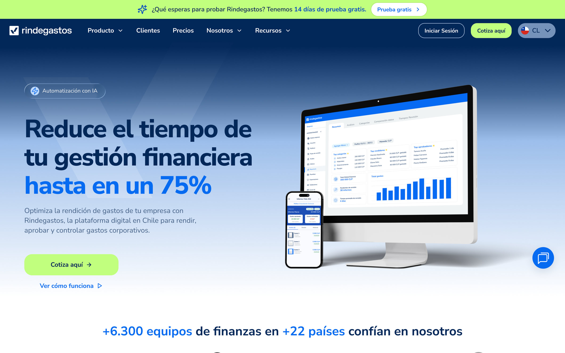
The redesigned homepage, as it lives today.
A strong product, an aging site.
Rindegastos had grown into a market leader, but its public site no longer reflected the product's maturity. Hierarchy was flat, key pages were hard to find, and the visual language lagged behind the brand.
The company needed a full redesign, not a facelift, covering every page a prospect touches on the way to becoming a customer.
The whole public surface, end to end.
I redesigned 20+ pages across desktop and mobile: homepage, product and feature pages, pricing and careers. I restructured the information architecture and rebuilt the visual hierarchy page by page.
One message, one action.
The previous homepage led with a generic promise and split attention between two competing buttons. The redesign opens with a concrete outcome (cut financial admin time by up to 75%), gives the page a single primary action, and moves social proof up where buyers look for it.
Before
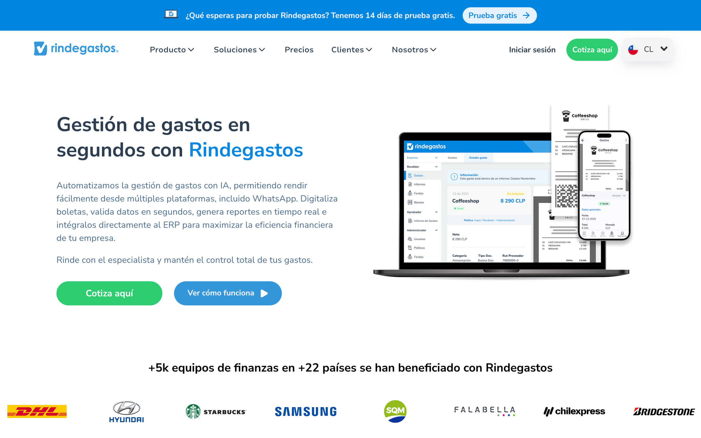
After
Same viewport, before and after: a quantified headline, one primary call to action, a calmer visual hierarchy.
Beyond the homepage.
Each product page follows the same structure: a clear promise, the product in context, then proof. That way the site reads as one system instead of a collection of pages. Here are ten of them on desktop:

Pick a page, then scroll inside the window to see all of it.
Designed for the phone, not shrunk to fit it.
Every page has its own mobile layout. Headlines are rewritten to fit a small screen, the main action stays within reach, and product visuals are recomposed instead of scaled down.
- Home

- App

- Gestión de gastos

- Scanit 2.0

- Rindepay

- Caja chica

- Kilometraje

- Viajes y viáticos

- IA & automatizaciones

- Concil-IA

- Plataforma

- Seguridad

Scroll inside any phone to see the full page.Swipe sideways for more pages. Tap a phone to scroll through it.
Shipped, and live.
The redesign is in production across the full site. The best kind of portfolio proof is one you can visit.